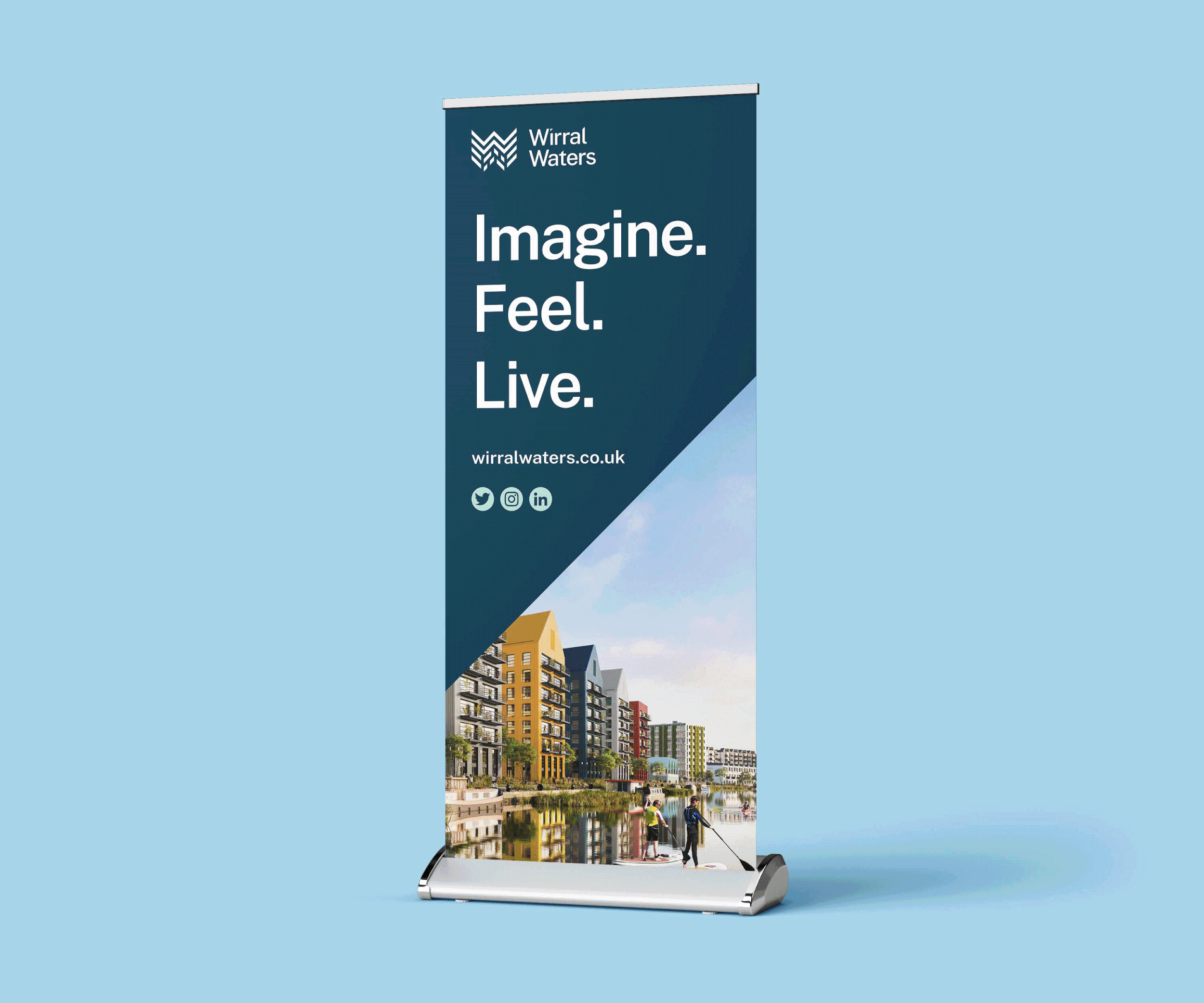
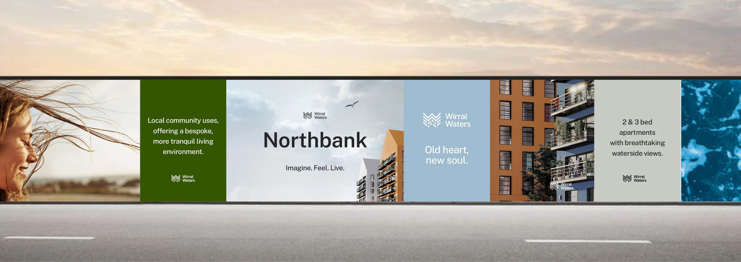
Brand Identity | Large Format Print
Destination Branding for Northbank, a Wirral Waters neighbourhood
Northbank is a residential-led neighbourhood offering city living with 'space to breathe,' providing a bespoke, tranquil environment by the water in Wirral Waters.
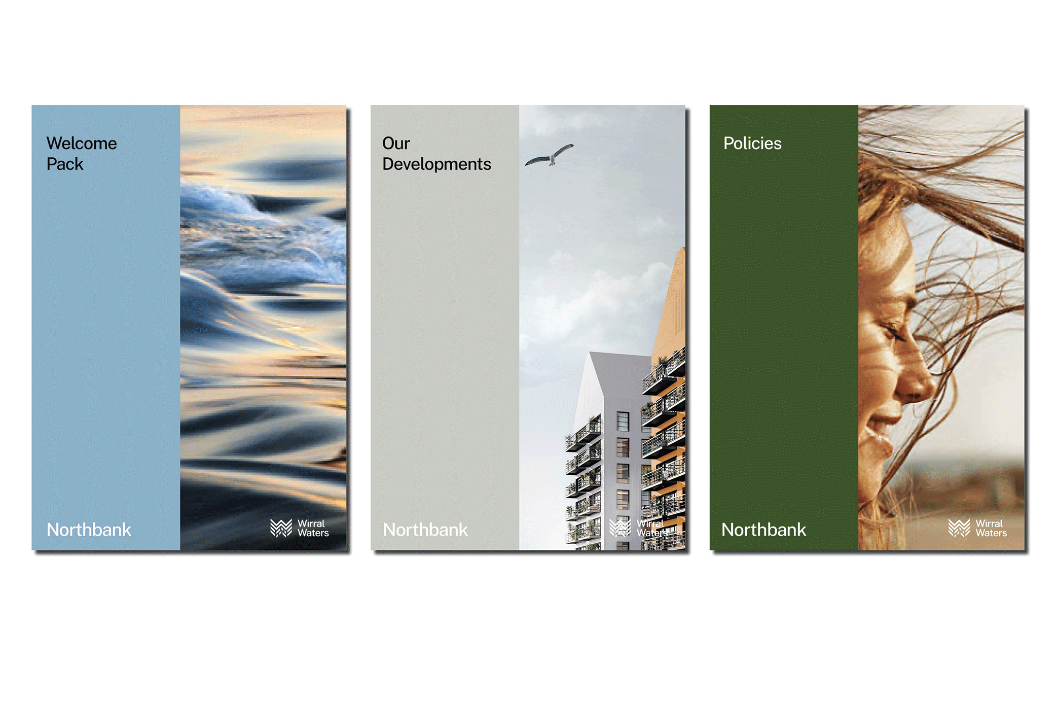
We revitalised the brand identity, drawing inspiration from Wirral Water’s surroundings and the people who live, work, and visit the area. The new identity remains relevant to those it impacts while showcasing a sense of calm that continues to evolve. By redefining the Wirral Waters story with a refreshed narrative, we can engage with the community more effectively and firmly put Northbank on the map to gain more residential and commercial enquiries.
Collaboration - Illustration, Tom Pearson
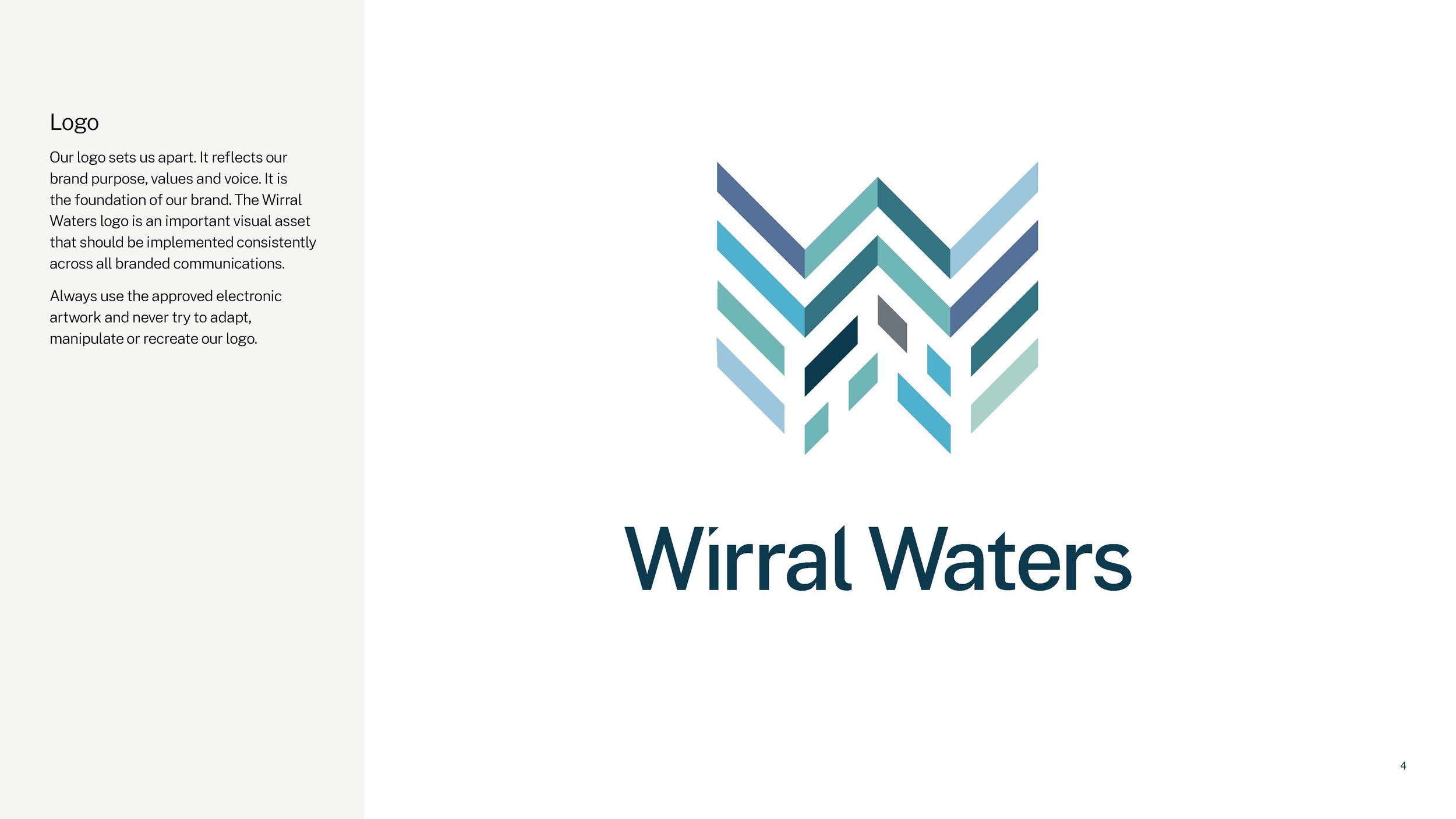
Representing the Spirit of
Wirral Waters

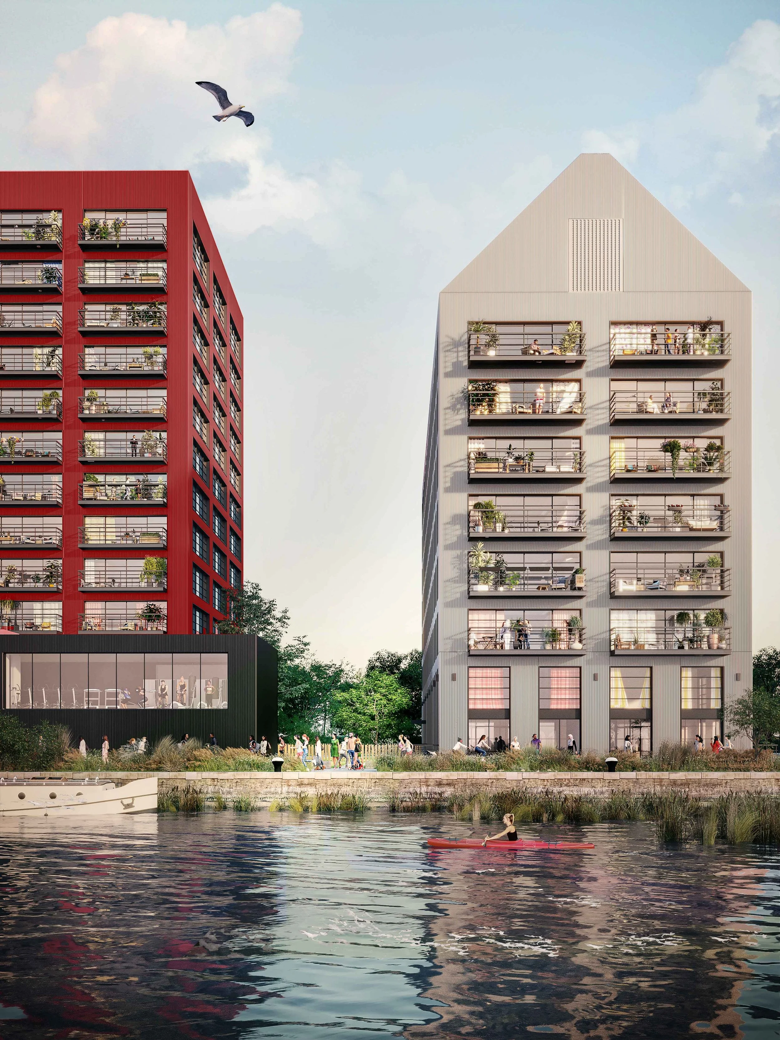
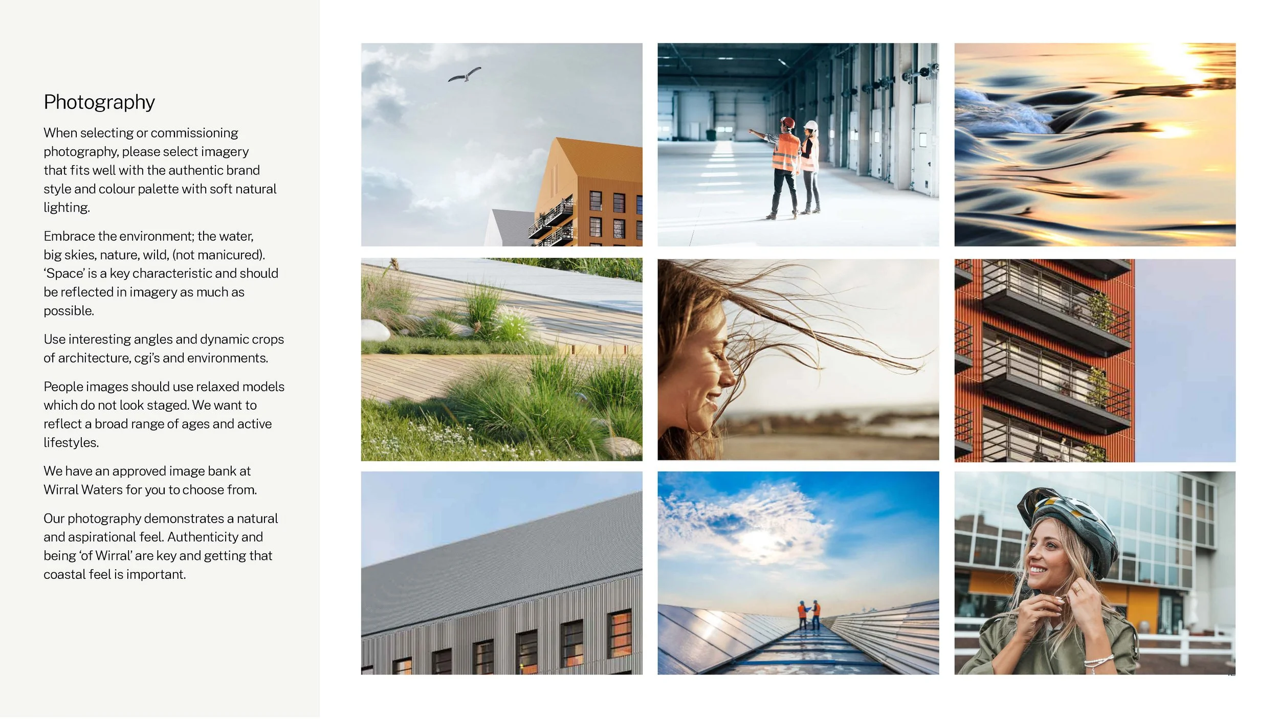
The essence of Wirral Waters will be captured throughout its photography, we wanted to show everything the project has to offer, but to also celebrate the elements on the River Mersey.
Style and colours found within the photography should complement the brand colour palette, with soft natural lighting. The surrounding environment should be embraced, with skies, wind and nature, with dynamic crops of architecture and unique angles which leave the viewer wanting to investigate further.


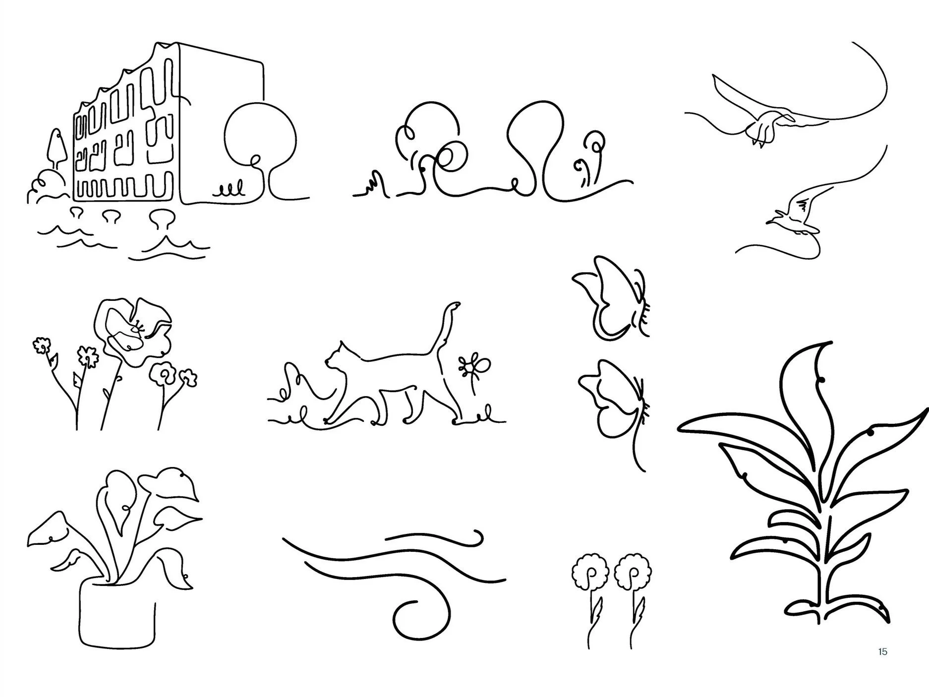
We wanted to introduce an illustration style to avoid a corporate-looking brand. While ensuring the illustrations didn’t overpower the page and draw too much attention away from key messages. Continuous line art introduced a calm flow to the page, this style neatly enhanced the brand’s colours and layout with lots of versatility.
The illustrative style could be implemented in various environments. With many large format applications existing in and around the Wirral Waters site, the possibilities of this illustrative style have shown huge promise.
Introducing illustration


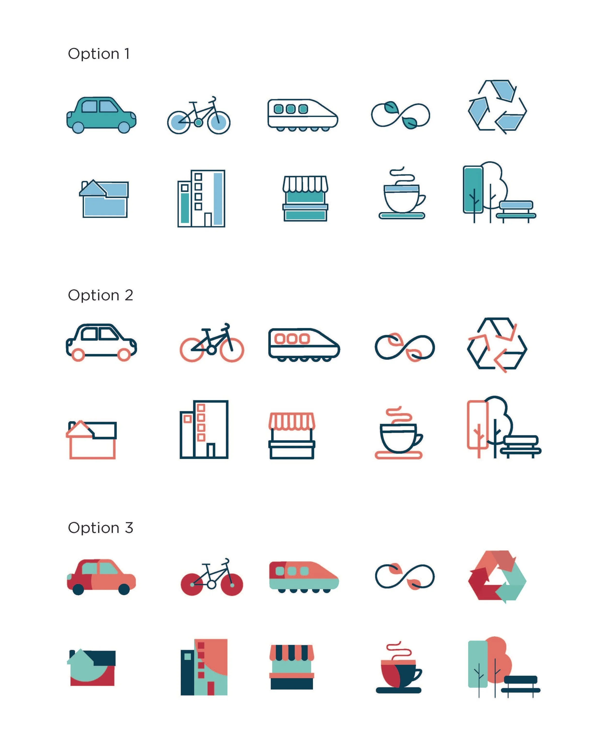


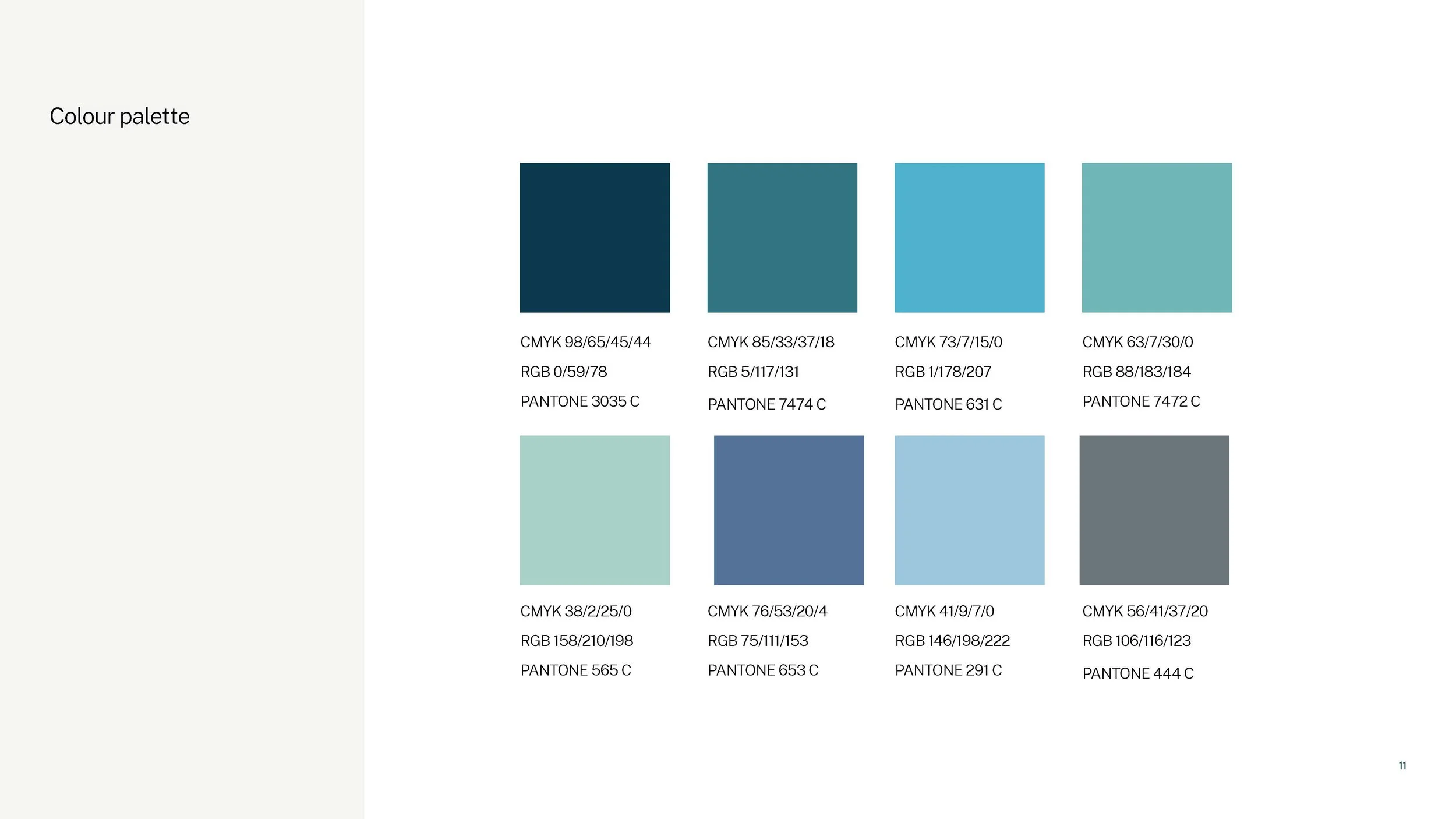
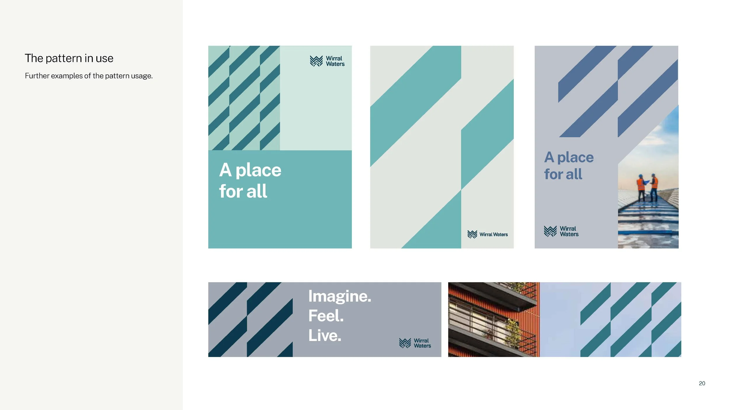
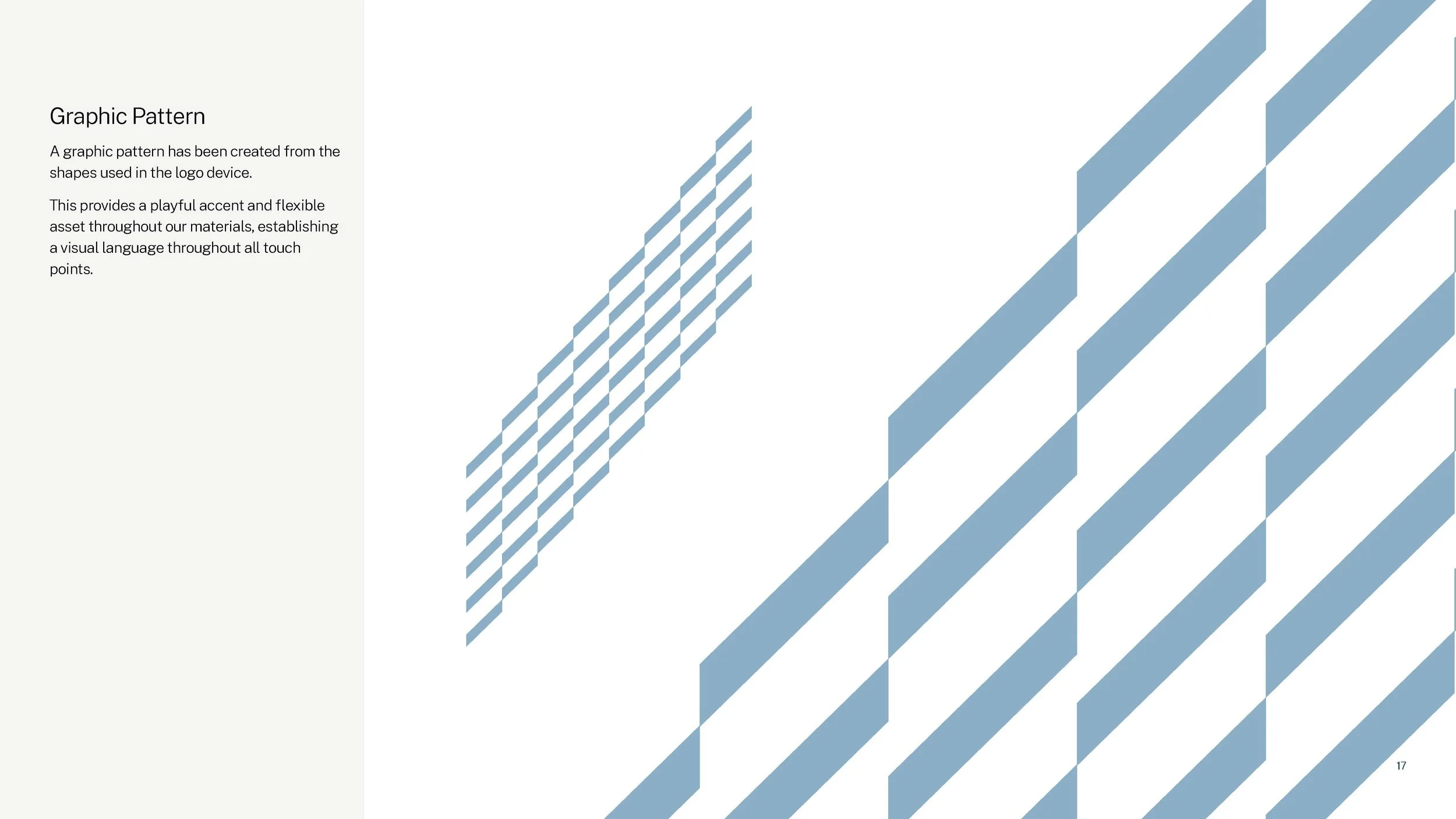
Graphic Pattern

A graphic pattern has been created from the shapes used in the logo, establishing a visual language throughout all touchpoints.